Friday 19 September 2014

Evaluation

1. What I have learned about conventions and gender representation from my research, when we was making our album covers we got shown a tv series about Hip Hop Honeys on BBC three. Once we had watched it I realised about the diffrent way people are represented through out the music industry. On an album cover there must be certain things that are needed to make it look good. It needs a title usually at the top of the album but sometimes it is put at the bottom or going up the side this makes it stand out. On rare occasions the name of the album is named after on on the songs on the cd this is because it might inspire the artist or mean something to him. Album covers usually have a picture of the artist on the front so people know who the artist of the cd is.This could be at the bottom of the album cover or at the top as long as the customer can see it, it shows that the album is all about them on other album covers they might place a picture of another country or theme which will show that the album is based around them. The name of the album should be bold or large text this is so that it will stand out from the rest of the cover this is because then it is easier for the customer will know straight away who the artist is. On album covers there should be copyright symbol this is because then no one can copy anything on the album. For example any of the songs on the cd. For example on the album cover below the text is bold and stands out from the black background. The artist is also wearing all red which links in with the font colour. It also has the parental advisory at the bottom left corner this is showing that there is rude language involves in some of the songs on it. The sub title shows that the album is about red. It says 'The Red Album' this shows why all the album is red.
The representation of this album cover is aimed at young males that like rap music. This artist could be showing his lifestyle or how he dresses. This is proberly 15 and above because of the language involved in some of the songs.

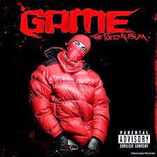
The artist is wearing them clothes because this is what rap artists wear, this is how you can tell what genre it is.


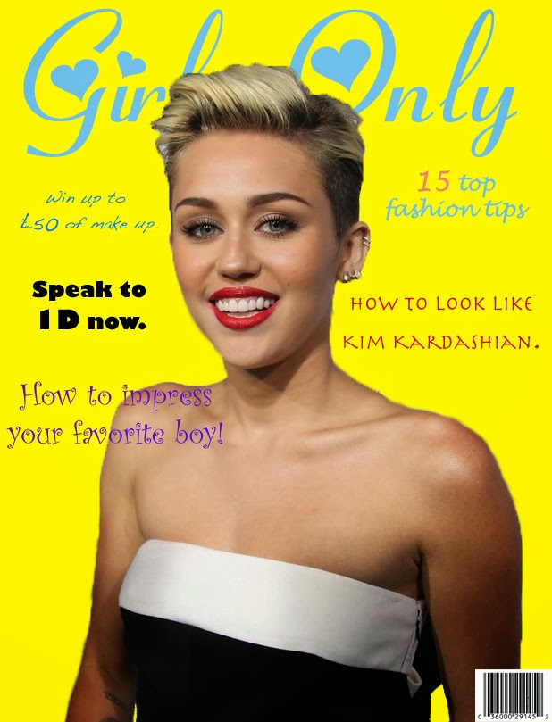
2. We had to make a front and back album cover in photoshop. All conventions must be added. Firsty we had a sheet which tought us what we needed on our albums. Secondly we had to create what our album covers would look like on a template that was made for us. After we had started to begin our photoshop had to take pictures and have someone in the class as your artist on the cover. I had to learn about all the tools on photoshop because I had never used it before. I had to restart my design half way through because I lost all my work.

3. For my cover design I took a picture of one of the other students in my oiclass he was facing the camera with his fists up. He was in a hoddie with the hod up and looking at the camera, This is showing direct address because then he is looking at the customer when he buys the CD. My backgroud is a rough image in london. This is to show the genre of the album is hip hop.

4. I used many skills when I was creating my album cover. Firstly I had to add the background and then change the size of it. Secondly I had to add the image of Ronan and change the capacity to lower because then you can see the background through the image aswell. My title I added a drop shadow so that it would stand out more from the image. Above Ronans head it says who it is, with that text I bended it round so it bends at the top on Ronans head, This also has a drop shadow.

5. On my back cover I used the same image as my front cover, I done less detail on it as the front cover. I had to large the image that I used to stretch it on the back cover. I added a barcode in the bottom corner so people can purchase my album. I added text to tell everyone what the name of my songs where, I turned the capacity down on it so that you can see the background image aswell. I then added the copyright sign aswell so that no one can copy my design or songs.

Monday 14 July 2014

cover lines

cover lines 
1. How to impress your favorite boy 

2. Speak to 1D now 

3. You could look like Kim kardashian 

4. How to get skinny quick 

5. This years fashion tips 

6. How to put make up on

7. How to get your eyebrows smaller 

8. Win £50 worth of make up 

9. How to make your summer better 

10. clothes that you will need.

Titles 
LMW - Ladies Mag Weekly 

GO - Girls Only 

Fashion Weekly 

GMW - girls mag weekly

GFM - Girl Friend weekly

colour connotations in magazines


Different colours can convey different meanings or connotations to the viewer.


I would use yellow for sport because the meaning of yellow is about fun, humor, lightness, personal power, intellect, logic and creative. I would use yellow for the background and then use red for the cover lines. e.g. 

I would use orange for gaming because the meaning of orange is about creativity, optimism, pleasure and emotional expression. I would use this orange for the background and yellow for the cover lines. e.g. 

I would use red for ponies because the meaning of red is about physical energy when ponies are running around, for there stamina and there stability for when they are standing. I would use red for the background and blue for the cover lines. e.g. the most amazing pony ride ever!

I would use green for bakery because the meaning of green is about balance, communication and nature. I would use green for the background and orange for the cover lines. e.g. how to make the best valentine cakes ever! 


Friday 13 June 2014

Question 1,2 and 3

1) Explain two ways the extract fits the genre of lifestyle magazine.
    Use examples from the extract.
A) Direct address and the other is a celebrity that has been used on the front cover. These two conventions have been used get the reader feel more involved. Direct address males you feel like the magazine is speaking to you and asking you questions. If the celebrity was not looking straight at you, it would not make you feel like the magazine appeals to you.

2) Explain how each of the following is used in the extract to create effect: 

  • Layout 
  • Typography 
  • Colour 
  • Language 
A)  The layout of the magazine is like this so that the main image stands out and makes you want to read the magazine. The main cover line is 'summer's here' it is written in bold because it is telling you something. 
       The typography of the magazine is sans serif to make the text stand out and catch the readers eye so that it makes you want to read the magazine. The text near the bottom of the page is serif to make it look fancy. This is a stereotype aimed at women. On the magazine most of the cover lines are bold these are bold so they stand out and make the reader get interested. 
        The colour of the magazine headline is pink so that it stands out from the rest of the page because the other colours on the page are black or white. the background is a grey colour so that the writing and image stand out more from the rest of the page. The main cover line is black so that it stands out. 
        
 3) Discuss how people and lifestyles are represented in the extract. 
     Refer to stereotypes in your answer
     use examples from the extract 
A) The are not many issues with the representation of the magazine. She is not wearing any tight clothing or anything that would represent them in a sexual way. The way she is looking on the magazine is a little promiscuous. Some of the headlines may be considered promiscuous. One of the headlines talks about marriages. This represents females in a negative way because these type of magazines don't normally have much variety in subject. 

Thursday 24 April 2014

Easter Homework

1. A main image is important in a magazine because it draws the customer in and shows them a slight overview on the magazineIn this magazine they used a well known successful person for the main image to give the reader someone to aspire to. It also gives the reader a chance to learn about that person. 

2.The key words of each story is highlighted in bold, for example in the title Your party dress code the word party is highlighted in a red font possibly to show the passion or the increased physical activity that often happens at a party also the font used for the word party is serif this could suggest the opposite to what the font colour suggests but as the article is about choosing the parties dress code so it nicely links in with the article. 

3.

Thursday 27 February 2014

magazine cover

www- The variety of colors used in the cover of my magazine.

www- a variety of fonts used on the cover.

www- good use of cover lines all around different topics.

Ebi- the image blended in a bit more.

Ebi- could name the model so people know who she is.

Ebi- add a selling line on the cover so it is more detailed.

Thursday 13 February 2014

Three magazines


                            According to the wheel this magazine is about love and inner peace.
However as you can see this magazine is showing the best footballer in the world and is about football not love or peace.
This magazine has a purple backround and many cover lines talking about things such as sex. This tells us that it is aimed at women. Furthermore the title of the magazine and the celebrits dress are lighter colour balancing the colours.

This magazine uses colours red, yellow, white and many shades of blue. Red aswell as blue this colour is very masculine to draw the attention of men. The red is also used to show stamina and physical energy. Blue - Blue is used in many different shades the light blue is a soothing, calm blue. But the darker blue gives a thick, bold look which makes the viewer see it initially, before anything else. Again in this magazine the background is a poring, plain colour, this is over used in magazines to make the more important ideas stand out. Yellow - Yellow is used here to highlight very few bits of text, this colour is used because it is bright and stands out.


Monday 13 January 2014

Balance


The magazine in the top left is symmetrical because everything is in the middle and doesn't
 need to be balanced out.
The magazine in the top right is asymmetrical because smaller items are smaller on one side and then they are balanced out by large picture.
The magazine in the bottom left is asymmetrical by colour because the brighter colours are balanced out by the darker colours on the other side.
i have chose this picture because it has light colours and then the black colours balance it out.
i have chose this picture there is a large flat area without much detail in the picture also there is small pictures and bigger pictures.

i have chose this picture because in the middle the picture is larger and the further out it goes the smaller it gets.